Developer Blogs
Working on the User Interface
Hello everyone, my name is Michael Voigt, and I’m the Lead UI Artist here at BioWare Austin. In this blog, I’ll share some of our vision and goals for the user interface in Star Wars™: The Old Republic™ and the solutions that we used to achieve them.
The Original Vision
During the early phases of prototyping we determined that we wanted a user interface that was more streamlined than most standard MMORPG interfaces. We wanted the user interface to neither detract from the world nor hinder the explorative nature of the game. We also felt that other MMORPG user interfaces were made up of a lot of complex shapes and very detailed outlines. We felt our silhouette needed to be sleek and simple and not add any extra complexity.
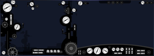
We used the analogy of the cockpit of a steam locomotive compared to a modern sports car. The locomotive had indicators and dials jumbled in all corners of the cockpit and the sports car had a sleek driver dash containing all the necessary indicators in an organized layout. This illustration shows the differences we were thinking about.
Interface Layout
Our game features beautiful scenic vistas and we wanted the user interface to complement those and not take away from them. The simplified sports car style silhouette gave a more letter-boxed effect and we felt this introduced less visual noise overall.
As we gradually worked to solve the complexity of the user interface, we had to ensure that the player was always provided with clear game indicators and controls. It was also critical not to alienate the seasoned MMORPG player. MMORPG standards are well established, and we did not want to stray far from those; players expect to have the ability buttons mapped close to associated keys, for example.
We analyzed each system and determined which areas could use improvement that wouldn’t confuse seasoned players and would also be intuitive for new players. Our goal was to introduce a familiar MMORPG interface that was less intimidating and innovative, all at the same time.
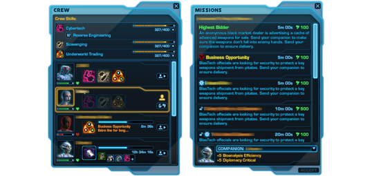
The Logical Grouping of Systems
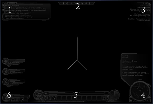
As the different controls for various game systems came together we took the time to develop a logical layout for these. We took the canvas of the screen and broke that out into corners of the screen. The controls felt right pressed into these corners so as not to obscure the center combat area of the screen. Much like the controls of a sports car do not cover the view of the road, our game controls do not cover the combat/explorative portion of the game world.
Interface Layout
We came up with the following structure which you can see above in diagram form:
- Social Systems: Chat - Top left
- Game Systems : Help - Top Center
- Mission Systems: Top Right
- Navigation Systems (World Indicators) - Bottom Right
- Combat Systems: Experience (Player Indicators) - Bottom Center
- Party Systems: Companion - Center-to-Bottom left
After putting together this basic structure, we developed screen mock-ups. These were variations of different style treatments, with some mimicking real-world materials and some being more abstract. This provided a good basis to ensure we had a strong candidate to continue work on.

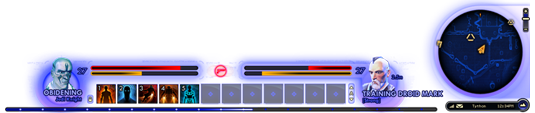

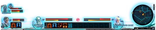
Screen Mock-ups
The strongest was selected and further iterated on. While we were iterating, we returned to our core concerns – that players of all experience levels would be able to easily use the interface. We also decided the final UI candidate needed to be streamlined, sleek and complementary to our worlds.
Then we took some time to look at our framing, in other words how the UI elements work around the action of the game. We noticed that the trend in game interface framing seemed to be that frames were becoming more minimalistic. For example, if you look at some of BioWare’s earliest games, often the game interface is quite large with quite a bit of framing.
We analyzed this further and noticed that screen resolution had a lot to do with this thread. Today’s graphic cards and monitors can output and display much higher resolution imagery than the VGA monitors and single-chip graphics cards of old. Older games had to have much larger framing elements to ensure text was a legible size. By contrast, we also had to be careful because screen resolution has gotten so high that text can be made too small to be legible. In The Old Republic players will be able to set their text-size preference, but we wanted an extremely usable default experience.
Increased Text Density
With all of these considerations in mind, we decided to make further refinements to reduce the amount of framing on-screen. We wanted to utilize almost all of the interface’s screen space for indicators and controls, leaving only the necessary amount of framing.
When this stage was completed, I actually felt that we held on to some framing for aesthetic purposes that could have even been further reduced - but we still had time to iterate, so more on that later.
With framing work complete for now, we took a pass at lessening the density of information and the overall ‘heaviness’ of the user interface. We found that reducing the amount of text was a great way to achieve this. Where possible, we found methods to symbolize text with icons. We trimmed the always-on text to be only the essential pieces. The overall outcome was an interface that didn’t appear overly cluttered.
Implementation
At this stage, much of our work was pure design, but with this framework in place we started the implementation of the user interface in-game. Working always with our original vision in mind, we brought each of the interfaces for our game systems online one by one.
Various Systems
With so many game systems in The Old Republic, the implementation phase was quite extensive. Most of our game systems involve quite a bit of interface interaction, and can also be quite varied, but our team of extremely talented interface developers really carried this implementation. They turned our vision into in-game reality. It was quite exciting for my team to watch them work their magic and see our designs come to life, system by system.
While it’s extremely gratifying to have my team’s vision seen in the game, The Old Republic is continuously undergoing feedback testing, both internally and externally. During implementation we were always reacting to feedback from everyone and improving the quality of the interface. We certainly see this as a process that will continue through launch and beyond.
Aesthetics
After the core systems were in-place, we took a deeper look at our aesthetics and decided to ‘tighten up the graphics’. We wanted to further raise the bar and really up the ante on our overall interface quality.
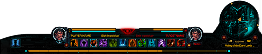
Evolving Style
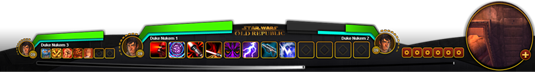
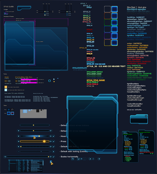
To achieve this, we invoked the power of our concept artists to take our existing vision and increase the visual fidelity. Having a pass focused solely on visual qualities was essential to unifying coloration, theme and overall consistency. As you can see from this style guide, we worked hard to ensure consistency!
A Unified Theme
As mentioned before, even after working on our framing, I felt that we still had a bit of excess framing. The interface still wasn’t as minimal as it needed to be. However, during this aesthetic pass, I feel we trimmed the fat and completed our solid visual direction.
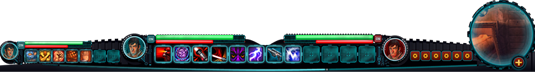
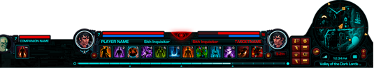
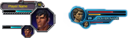
This pass also allowed us to capture some elements that were neglected along the way and give them the proper attention needed to ensure our high quality level. Right now, this image is representative of the current interface in The Old Republic.
Evolving Style
Our user interface has changed quite a bit within the ever-changing games market environment. I feel we are well on our way to achieving all of our goals and we will continue to analyze the market, observe feedback and continue to improve until ship and beyond.
I greatly enjoyed sharing this information with you and look forward to feedback and comments when you get to play The Old Republic!
Michael Voigt
Lead UI Artist


You are about to leave this website...
This page is not meant to keep you from following the link you've clicked on. It is just a warning that you are about to leave this website. To go to this page, click the link below.
If you do not wish to follow this link, simply close this message.
The statements and opinions expressed on these websites are solely those of their respective authors and do not necessarily reflect the views, nor are they endorsed by Broadsword, LucasArts, and its licensors do not guarantee the accuracy of, and are in no way responsible for any content on these websites, and the Star Wars: The Old Republic privacy policy does not apply to their information collection practices.
Multimedia Player
Optional Cookies, including those that support the Multimedia Player, are currently disabled based on Your Privacy Choices settings.
Choose Accept and Play Video to enable the Multimedia Player, including its associated Cookies. This may involve the collection and sharing of your viewing information by YouTube for analytics and advertising purposes.
You can also choose to watch the video on YouTube.